
The Ultimate Guide to Lighting Fine Art Prints
You found the print. You ordered it, hung it, stepped back, and something was wrong. The colors looked muddy, the highlights washed out, or a hard glare cut across the surface like a window reflection. Nothing kills the presence of a fine art print faster than the wrong light. If you want to know how to light fine art prints at home, the good news is that it's a learnable skill with a clear process behind it, and this guide covers everything: bulb specifications, lux targets, mounting geometry, fixture types, and surface-specific guidance for glossy acrylic and Chromaluxe metal prints.
Getting the light right isn't a decorating luxury. It's the difference between a print that commands attention and one that disappears into the wall. Lighting fine art prints at home well means understanding what you're asking a light source to do, both visually and in terms of long-term preservation.

Why Lighting Is the Defining Factor for How Your Prints Look and Last
Poor lighting creates two distinct problems, and most home collectors only worry about one of them. The first is visual: the print doesn't render the way it was intended. The second is physical: the wrong light slowly destroys the print over months and years. Solving both requires understanding what you're actually asking a light source to do.
How Light Changes What You See in a Fine Art Print
Color temperature shifts the perceived tonality of a print in ways that are subtle at first and obvious once you know what to look for. Warm light below 2700K yellows the whites and distorts cool shadow tones, making a carefully balanced landscape feel muddy. Light that runs too cool, above 5500K, flattens warm-toned images and gives the room a clinical feeling that works against the print's mood. This matters most in black-and-white and infrared photography, where tonal range and mid-tone separation define the entire image. The wrong bulb can genuinely make a museum-quality print look like a grocery store poster.
The Preservation Risk Most Home Collectors Don't Think About
UV radiation from sunlight, halogen lamps, and older fluorescent fixtures accelerates the breakdown of inks, pigments, and paper fibers. Even modern, low-UV LEDs contribute to cumulative fading when lux levels run too high or display hours are long. The fading is rarely dramatic from one day to the next, but over years the shift is real and irreversible. This is why lux levels and bulb specifications matter as much for preservation as they do for visual quality.
How to Light Fine Art Prints at Home: Bulbs, CRI, and Color Temperature
The main verdict here is simple: warm, high-CRI LEDs are the right choice for home collectors today. They emit negligible UV, produce minimal heat at the print surface, and come in the color temperatures that render photographic prints most accurately. The details below tell you exactly what to look for on a product listing or spec sheet.
Color Temperature: The Difference Between a Warm Gallery and a Clinical Showroom
Color temperature is measured in Kelvin, and the number tells you where the light sits on the spectrum from warm to cool. For color-accurate print evaluation, 5000K (the D50 standard) is what print labs and professional photographers use. For a home gallery that still renders prints faithfully without feeling harsh, the practical sweet spot is 3500K to 4000K. Below 2700K, whites shift yellow and cool shadow tones lose definition; above 5500K, the light feels industrial. Shop in the 3500K to 4000K range for home display, and 5000K if your priority is color-critical evaluation.
CRI: The Specification Most People Skip (and Why They Shouldn't)
CRI, or Color Rendering Index, measures how accurately a light source shows color compared to natural daylight.The scale runs from 0 to 100, and for fine art display, 90 is the floor worth considering. A CRI of 95 or above is the standard for color-critical display of photographic prints. Bulbs rated below 80 create subtle but real color shifts: reds look muddy, blues appear faded, and the tonal separations that make a great print worth owning become harder to see. This specification is non-negotiable for any serious home display setup.
What the Data Says About LED, UV, and Heat Damage
Most quality LED picture lights emit little to no UV, making them far safer for prints than halogen or fluorescent alternatives. The more relevant concerns are blue-light content and heat from the fixture itself. Look for a stated low operating temperature, dimmable output, and, where available, a published M/P ratio of 0.4 or lower (melanopic-to-photopic ratio, a measure of blue-light content), a spectrum less weighted toward blue emission. Dimmable capability is critical: running the light at a lower output when the room is unoccupied extends the life of the print without sacrificing display quality when you're actually in the room to see it.
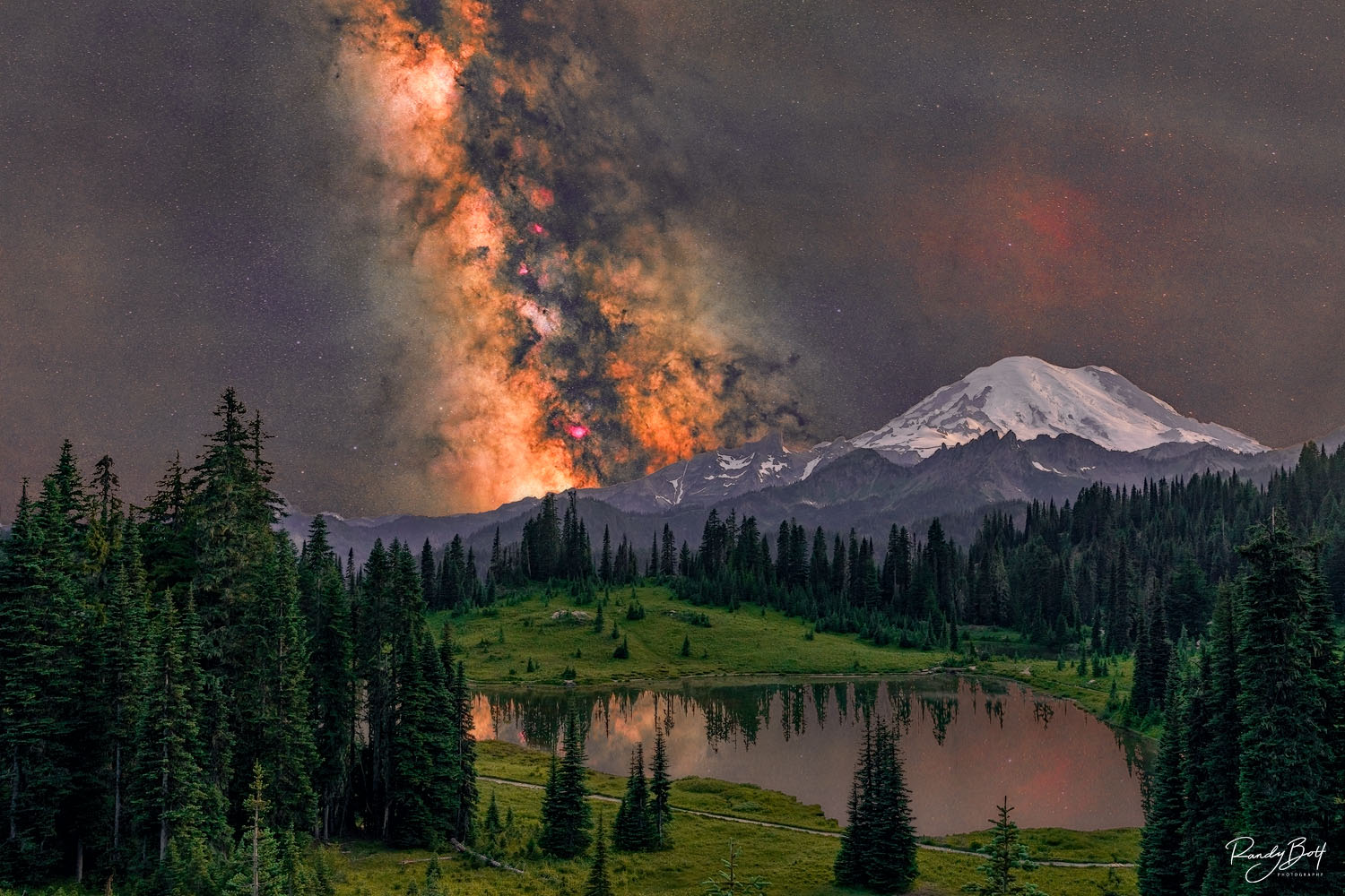
At 5,299 feet near Chinook Pass, Tipsoo Lake sits inside a quiet alpine basin, offering a breathless, front-row seat to the night sky. High above the southern horizon, the dense core of the Milky Way arches across an indigo void in a luminous, dust-mottled river of starlight. Framing the scene is the towering silhouette of Mount Rainier, its glaciated, snow-draped peak catching the faint celestial glow and standing starkly against the cosmos. Below, the glassy, undisturbed surface of the lake acts as a perfect dark mirror, reflecting every star cloud and the volcano's massive shadow to create a seamless, double image where earth and sky blur together in absolute silence. Limited edition from the Night Sky gallery.
Lux Levels for Home Display: How Bright Is Bright Enough?
Lux is a measure of light intensity at a surface, and it's one of the most important variables most home collectors never consider. The core insight is counterintuitive: brighter is not better. Excess brightness accelerates fading without improving perceived image quality past a reasonable threshold.
The 50, 100 Lux Rule for Fine Art and Photographic Prints
Conservation standards recommend a maximum of 50 lux for the most light-sensitive fine art works, including paper-based photographic prints. For modern print materials with limited daily display time, 50, 100 lux is an accepted practical range for home collectors. Going above 100 lux doesn't improve how a print looks and increases cumulative fading risk over months and years of continuous display. Most home lighting setups run well above this range without the homeowner realizing it, which is why measuring matters.
How to Measure and Adjust Lux at Home Without Professional Gear
A basic smartphone lux meter app provides a useful approximation to start with. Hold the phone flat against the print surface with the sensor facing the light source and read the value. If the reading sits well above 100, move the fixture further away, reduce beam intensity, or dim the bulb. Take readings at the center and edges of the print to check for uniformity, not just overall brightness. Dimmable fixtures are essential here because they let you dial in the right level precisely rather than guessing at distance alone.
Getting the Angle and Distance Right, Especially for Glossy and Metal Surfaces
Even a perfect bulb will create glare and hotspots if the fixture sits at the wrong angle. The geometry of art lighting isn't complicated, but it requires deliberate setup, and it changes depending on whether your print is on matte paper, glass-covered, or a glossy metal or acrylic substrate. Knowing how to light fine art prints at home properly means paying close attention to this step, particularly with reflective surfaces.
The 30-Degree Rule: Where to Start for Most Framed Prints
The most widely cited starting point for picture lighting is a 30-degree angle from vertical, with the fixture mounted roughly 5 to 7 inches above the top of the frame. This geometry pushes the reflected light away from standard standing and seated viewing positions. For larger works, shifting toward 35 degrees helps cover more surface area without creating a hotspot at center. The fixture should be approximately half to two-thirds the width of the artwork to ensure even coverage rather than a bright center with dark edges.
Lighting Acrylic and Chromaluxe Metal Prints: A Different Set of Rules
Glossy surfaces like HD Acrylic and Chromaluxe metal prints behave like mirrors rather than scattering light the way matte paper does. A poorly positioned fixture sends a reflection directly into the viewer's sightline, washing out the image entirely. Start the fixture slightly higher than you would for a paper print, use a wide-beam or diffused LED bar rather than a narrow spot, and test from both seated and standing positions before finalizing placement.
The Chromaluxe metal prints in the Randy Bott Photography collection are a strong example of how much the lighting choice matters. These prints carry a luminous depth that matte surfaces cannot achieve, with the metallic substrate giving highlights a three-dimensional quality that comes fully alive under warm, directional light. Positioned correctly, the light seems to emerge from within the print rather than bouncing off it. Plan your lighting setup before the print arrives so you're ready to display it at its best from day one.

The InterContinental Bellevue rises with a quiet sense of precision, its modern glass façade reflecting both sky and city in clean, uninterrupted lines. In a fine art black and white photograph, the building shifts from a commercial structure into a study of form, contrast, and rhythm. Light defines the image. Bright highlights trace the edges of the architecture, while deep shadows carve out depth between panels of glass and steel. The absence of color removes distraction. It directs focus to geometry, repetition, and proportion. Each window becomes part of a larger grid. Each reflection becomes a layered composition within the frame. Limited edition print from the Panorama gallery.
Fixture Options: From Budget DIY Setups to Dedicated Picture Lights
Not every collector needs a full track lighting installation. The right fixture depends on how many prints you're displaying, the room's architecture, and how visible you want the hardware to be. Here's an honest look at what each approach delivers.
Budget and DIY Approaches That Actually Work
The most effective low-cost approach is two lamps placed symmetrically on either side of the print at equal angles, using bulbs that meet the CRI and color temperature targets above. Adding diffusion material (white parchment paper or a fabric diffuser) in front of the light source softens hotspots significantly and broadens coverage. This setup works best for smaller prints and rooms where fixture visibility isn't a concern. The tradeoff is consistency: DIY setups are harder to replicate across multiple pieces on the same wall, and angle control is imprecise.
Track Lighting, Adjustable Recessed Lights, and Dedicated Picture Lights
Track lighting offers flexibility in repositioning, but narrow beam heads create uneven highlights if they're not paired with diffusion or a wide beam angle. Adjustable recessed lighting is the cleanest visual solution for a dedicated gallery wall, allowing precise aiming without any visible hardware above the frame. Dedicated picture lights are purpose-built for artwork: they mount directly above the frame, wash the print surface evenly, and keep the fixture itself discreet against the wall. For most home collectors with one to four prints on a display wall, a quality LED picture light in the right color temperature is the simplest and most reliable solution. Look for models with adjustable heads, dimmable output, and a stated beam angle wider than 40 degrees for even coverage.
A Simple Lighting Plan You Can Implement This Weekend
The specifications above mean nothing if they stay abstract. Here's how to translate them into an actual setup you can build and verify before calling it done.
How to Light Fine Art Prints at Home: Matching Your Fixture to Print Type and Room Setup
For paper prints in a standard-depth frame, use a picture light or adjustable track head rated at 3500K to 4000K with CRI 95 or above. Mount it 5 to 7 inches above the frame at a 30-degree angle and dim it until a lux measurement at the print surface reads between 50 and 100. For glossy acrylic or Chromaluxe metal prints, use a wide-beam LED picture light or diffused LED bar with the same color temperature and CRI specs, mounted slightly higher and at a wider angle. Test the reflection from both standing and seated positions before finalizing the mount. Turn ambient overhead lighting off so you can isolate exactly what the picture light is doing to the surface.
The Final Check Before You Call It Done
After installation, stand at every normal viewing position in the room and look at the print directly. No bright reflection or hotspot should appear in your direct sightline. The print should look evenly lit from edge to edge, without the center appearing noticeably brighter than the corners. If glare persists, raise the fixture slightly or shift it toward 35 degrees. Once the position is right, measure the lux at the print surface with your phone app and use the dimmer to bring it to the 50, 100 lux target. Then leave it alone: consistent, low-level illumination is the best combination of visual quality and long-term print preservation.
Prints Worth Lighting
A print that looks perfect under the right light is the result of two decisions made well: choosing the artwork, and choosing how to display it. Neither works without the other. Now that you know how to light fine art prints at home, the process is repeatable: warm, high-CRI LEDs at the right angle, lux levels kept to 50, 100 at the surface, and fixture choice matched to the print material.
If you're going to invest in a proper lighting setup, put that same attention into the prints themselves. Randy Bott Photography's limited edition Chromaluxe metal prints and Hahnemühle Baryta fine art paper prints are designed to respond to exactly this kind of thoughtful display. The infrared and black-and-white Pacific Northwest landscape work in the collection carries tonal depth and mid-tone separation that proper lighting makes fully visible. These aren't prints that sit quietly on a wall. Under the right light, they own the room.
Browse the full Pacific Northwest landscape collection at Randy Bott Photography and find the print your wall has been waiting for.

Oxbow Bend, at the magical Grand Teton National Park, becomes a breathtaking masterpiece when bathed in the warm glow of a sunset. This iconic location, situated along the winding Snake River, offers visitors an awe-inspiring display of nature's beauty and a serene setting for witnessing the enchantment of dusk. Limited edition from the Panorama Gallery.